The rainbow closet problem and the 3-2-1 kids wardrobe method
Open most kids wardrobes and you see every color shouting at once. That chaotic rail of kids clothes looks joyful, yet it quietly kills mixing and matching because no single outfit really talks to the next. A focused kids wardrobe color coordination guide will help you turn that chaos into a calm system where any child outfit works with almost any other piece.
The core issue is not the clothing itself, but the random colors and prints that arrive as a gift, a sale find, or a rushed daycare emergency buy. When each new item ignores the existing child wardrobe color scheme, you end up with lonely pieces that only work with one specific size or season. A smarter color palette means every new item you add has multiple outfit options, which instantly creates stylish combinations without extra effort.
Think of the 3-2-1 method as a capsule wardrobe formula for kids fashion: three base neutrals, two accent shades, and one wildcard item. You choose three base neutrals for bottoms and outerwear, two accent colors for tops and accessories, and one wildcard piece that breaks the rules. This simple option group of shades becomes your everyday kids wardrobe compass, and it will help you shop less, invest in quality basics, and still keep every child stylish comfortable.
For toddlers, those three base neutrals might be chocolate brown (for example, hex #4B2E2B), sage grey (#B2B8A3), and soft white (#F5F3EE). These base tones anchor the wardrobe, so even when a neon T-shirt or a printed denim jacket appears, the overall color scheme stays coherent. With this structure, you can mix match outfits quickly on busy mornings, while your child still feels free to choose their favorite colors.
Parents often worry that a capsule wardrobe sounds restrictive for kids. In reality, a tight color palette gives children more freedom to mix items, because almost everything works together. The result is a child wardrobe that feels playful to them, but looks quietly curated to you, and a simple 3-2-1 checklist on the wardrobe door (3 base, 2 accent, 1 wildcard) makes it easy for older kids to dress themselves.
Building a child-friendly color palette: base, accents, and wildcards
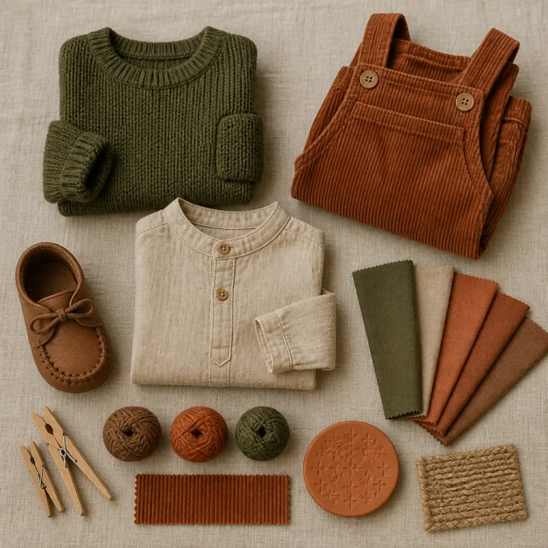
Start your kids wardrobe color coordination guide with the base, because everything else hangs from that decision. For urban toddlers, chocolate ganache (#3A231C), sage grey (#AEB29A), and off white (#F7F4ED) form a modern capsule wardrobe that flatters most skin tones and hides playground stains. These three colors in trousers, leggings, and outerwear will help every child outfit feel intentional, even when your kid insists on that superhero T-shirt again.
Next, choose two accent colors that express your child’s personality while still respecting the base palette. Lavender (#C7B7E6) and muted red (#B44A4A) are strong options, because they sit beautifully against both white blue combinations and deeper browns, and they transition well between seasons. When you repeat these accent colors in T-shirts, knitwear, and hair accessories, you create stylish echoes across the wardrobe instead of random pops.
The wildcard is where you let kids fashion breathe. This might be a fiery red denim jacket, a rainbow dress, or a graphic sweatshirt that breaks your usual color scheme on purpose. Limit wildcards to one or two items per size, so they feel special but do not hijack the whole wardrobe.
When you shop, think in option group terms rather than single pieces. Ask whether a new item works with at least three existing pieces in your child wardrobe, and whether its color repeats somewhere else in their clothing. This habit will help you invest quality time and budget into high quality items that actually earn their place.
For parents who already enjoy designer kids fashion, this palette thinking applies as much to a logo sweatshirt as to a supermarket basic. A sharply edited color palette makes it easier to style a statement shirt with simple quality basics, and guides you when you read any detailed styling advice such as a guide to styling a designer shirt for kids. The point is not the label, but how the colors and items mix together on a real child, and a printable palette card or downloadable swatch sheet in your chosen colors can keep you on track while you browse.
The 3-2-1 mix and match system in real life
Translating theory into the morning rush is where this kids wardrobe color coordination guide proves its worth. Picture a rail with three base trouser colors, two accent knitwear stacks, and one wildcard jacket, all in your chosen color palette. Any sleepy grab from that rail will help you create stylish outfits that feel coherent without needing a stylist’s eye.
For a practical example, imagine a capsule wardrobe built around chocolate, sage, and cream as base colors. Add lavender and dusty blue as accents, then choose one electric neon green hoodie as the wildcard, and suddenly mixing matching becomes almost automatic. Your child can mix match tops and bottoms freely, because every color already belongs to the same quiet family.
Footwear and outerwear often break a color scheme, so treat them as part of the base. White blue trainers, tan sandals, and a neutral raincoat keep the visual noise low, while a single red white beanie or scarf can echo your accent colors. This approach keeps kids clothes playful, but still lets you see the overall wardrobe as a system rather than a pile.
Buttons, trims, and prints matter more than parents think. A denim jacket with brass button details reads warmer than one with silver hardware, and that tiny shift changes how it sits within your chosen color scheme. When you shop, look closely at these small items, because they can either support your palette or quietly fight it.
Travel is the ultimate test of any capsule wardrobe for kids. If you can pack a week of outfits in a carry on using only your 3-2-1 palette, you know the system works, and resources like a carry on vacation wardrobe guide for kids align perfectly with that thinking. The goal is always the same, fewer items, more outfits, and a child who still feels stylish comfortable while running full speed toward the sea.
Seasonal shifts, skin tones, and integrating gifts without chaos
Color strategy only works if it survives real life, and that means seasons, growth spurts, and the constant arrival of gifts. Instead of rebuilding the kids wardrobe every few months, shift the weight of your palette while keeping the same base colors. In warmer months, you might add more white blue pieces and lighter fabrics, then lean into chocolate and sage for colder weather while keeping the overall color scheme intact.
Skin tone matters, especially for tops that sit close to the face. Children with warm undertones usually glow in earthy colors like terracotta, mustard, and olive, while cooler undertones suit oceanic blues, violets, and charcoal, and this simple observation will help you choose accent colors that flatter rather than fight. When you respect undertones, even a very small capsule wardrobe feels rich, because every outfit makes the child look rested and bright.
Gifts and hand me downs are where most palettes unravel. When a neon pink dress or a bold red white tracksuit arrives, treat it as a potential wildcard, and check whether it can mix match with at least two base items before giving it prime rail space. If it clashes with everything, keep it for costume play or occasional wear, rather than letting it dictate new purchases.
For parents juggling different sizes and siblings, think in family palettes rather than individual wardrobes. Maybe one child wardrobe leans earthy warm while another leans ocean cool, but you still share base neutrals like denim, cream, and charcoal across both kids. This strategy makes passing down high quality kids clothes easier, because the clothing already respects a shared color language.
As you refine your palette, you also refine what you look for when you shop. That focus naturally pushes you toward quality basics and away from impulse prints, which aligns with a broader move toward adaptive and size inclusive kids fashion explored in depth in recent coverage on inclusive kids fashion. The more intentional your colors, the easier it becomes to invest quality budget in pieces that genuinely work hard.
Four ready-made palettes that work hard for real kids
Sometimes parents need a starting template, not another theory, so here are four palettes that respect this kids wardrobe color coordination guide and still feel playful. The earthy warm palette uses chocolate (#4B2E2B), camel (#C49A6C), and cream (#F3E9DD) as base colors, with rust (#B25A3C) and mustard (#D9A441) as accents, and one lavender wildcard dress or shirt to keep things light. This option group suits warm undertones beautifully, and every item feels like it belongs in the same autumn park photograph.
The ocean cool palette leans on navy (#1F3044), slate grey (#6B717E), and soft white (#F5F5F2) as base colors. Teal (#2F7F8F) and lavender become the accent colors, while a single fiery red denim jacket acts as the wildcard, and this mix match combination flatters cooler skin tones and works especially well for school uniforms that already use blue. For a modern neutral palette, think sage grey (#AEB29A), stone (#C9C3B8), and off white as base, with dusty rose (#C58A94) and muted forest green (#4C6A57) as accents, plus one electric neon green hoodie as the wildcard for pure playground joy.
Parents who love bold brights can still have structure. Choose charcoal (#333333), deep indigo (#1E2758), and white (#FFFFFF) as base colors, then use primary red (#D0021B) and cobalt (#2554C7) as accents, and keep one rainbow print piece as the wildcard, and suddenly even very bright kids clothes feel edited rather than chaotic. Across all four palettes, the rule stays the same, repeat colors often, keep base tones calm, and let only a few items shout.
Whatever palette you choose, focus on high quality fabrics and finishes. A well cut T-shirt with a clean button placket in organic cotton or soft modal will help every outfit look sharper than a flimsy trend piece, even in the same color. Over time, this approach quietly shifts your kids fashion budget toward fewer, better items that survive both the washing machine and the climbing frame.
When you stand back from a rail built this way, you see harmony rather than noise. Your child still sees choices, colors, and favorite pieces, but you see a system that respects their comfort, your time, and the reality of everyday life. In kids fashion, the most stylish wardrobes are not what photographs well, but what survives the playground.
FAQ
How many colors should a toddler’s wardrobe have overall ?
For most toddlers, six to eight main colors are enough. Three base neutrals, two accent shades, and one or two wildcards give plenty of variety without chaos. Anything beyond that tends to dilute the palette and makes mixing matching harder.
Can siblings share a capsule wardrobe if they have different styles ?
Siblings can share base items like denim, neutral trousers, and outerwear if you keep those pieces in a calm color scheme. Let each child express their own style through accent colors and accessories layered over the shared base. This balance keeps laundry simpler while still respecting individual taste.
What is the best way to handle printed clothing within a palette ?
Choose prints that use your existing base and accent colors rather than introducing new ones. A floral or stripe that repeats your palette will help every outfit feel cohesive, even when the pattern is bold. Limit prints to a few hero pieces per size to avoid visual overload.
How often should I review and adjust my child’s color palette ?
Review the palette at each major size change, usually once or twice a year in early childhood. That is when you naturally replace several items at once, so it is efficient to refine colors then. Small adjustments, like adding a new accent shade, can happen whenever you notice your child gravitating toward a particular color.
Does color psychology really matter for young children’s clothes ?
Color psychology is not a strict rule, but it offers useful guidance. Warm tones like red and yellow can feel energizing, while cool tones like blue and green often read calmer, which can influence how a child feels in busy environments. Use this knowledge lightly, as one more tool alongside comfort, fit, and your child’s own preferences.
Sources
- British Fashion Council – childrenswear trend and sustainability reports summarising typical wardrobe lifespans, resale patterns, and fabric durability in everyday use
- American Academy of Pediatrics – guidance on children’s comfort, safety, and clothing choices, including advice on breathable fabrics, safe sleepwear, and appropriate layering
- Institute for Color Research – publications on color perception and psychological effects in everyday environments, such as how repeated color cues can shape mood and attention